by natashadobbs | Jun 2, 2022
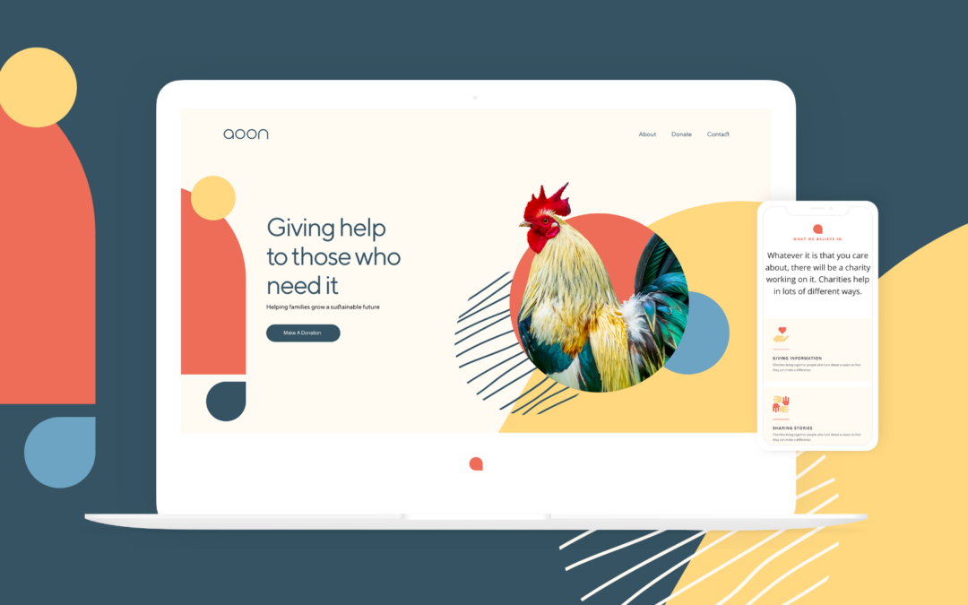
Aoon’s design colours are based in the rural lands of Algeria. The colours we want to use for the logo is based on the natural colours of these rural lands....

by natashadobbs | Jun 1, 2022
Primary...

by natashadobbs | May 31, 2022
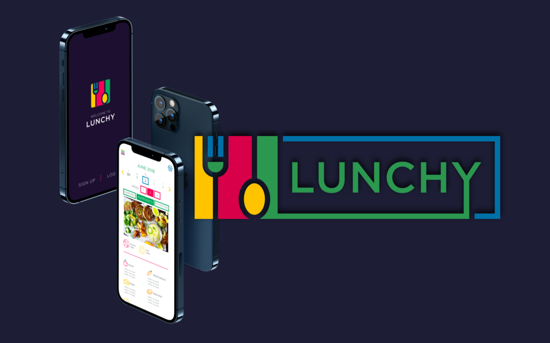
Lunchy is a school food ordering app, designed for children to have a balanced meal and combat unhealthy weight gain. The design started with a new corporate identity that played around with the functionality of opening a box. The client wanted something bright,...

by natashadobbs | May 30, 2022
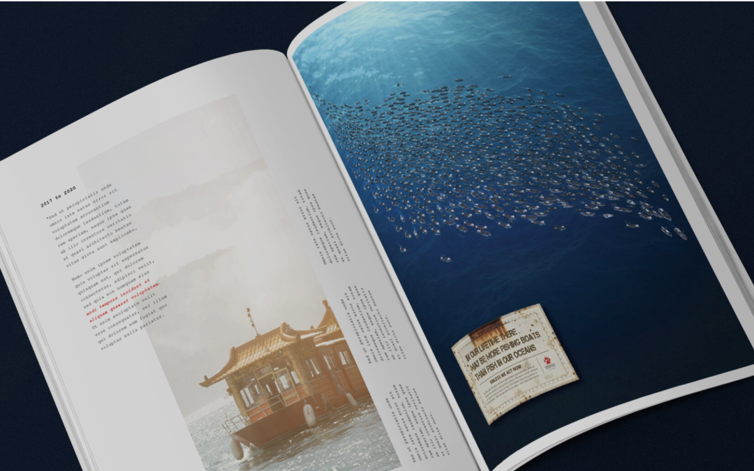
Endangered wildlife trust More boats than fish This print advert was for the Endangered Wildlife Trust to bring attention to the alarming rate at which our oceans resources are being depleted. It is our hope that this will act as a wake-up call and persuade people to...

by natashadobbs | May 30, 2022
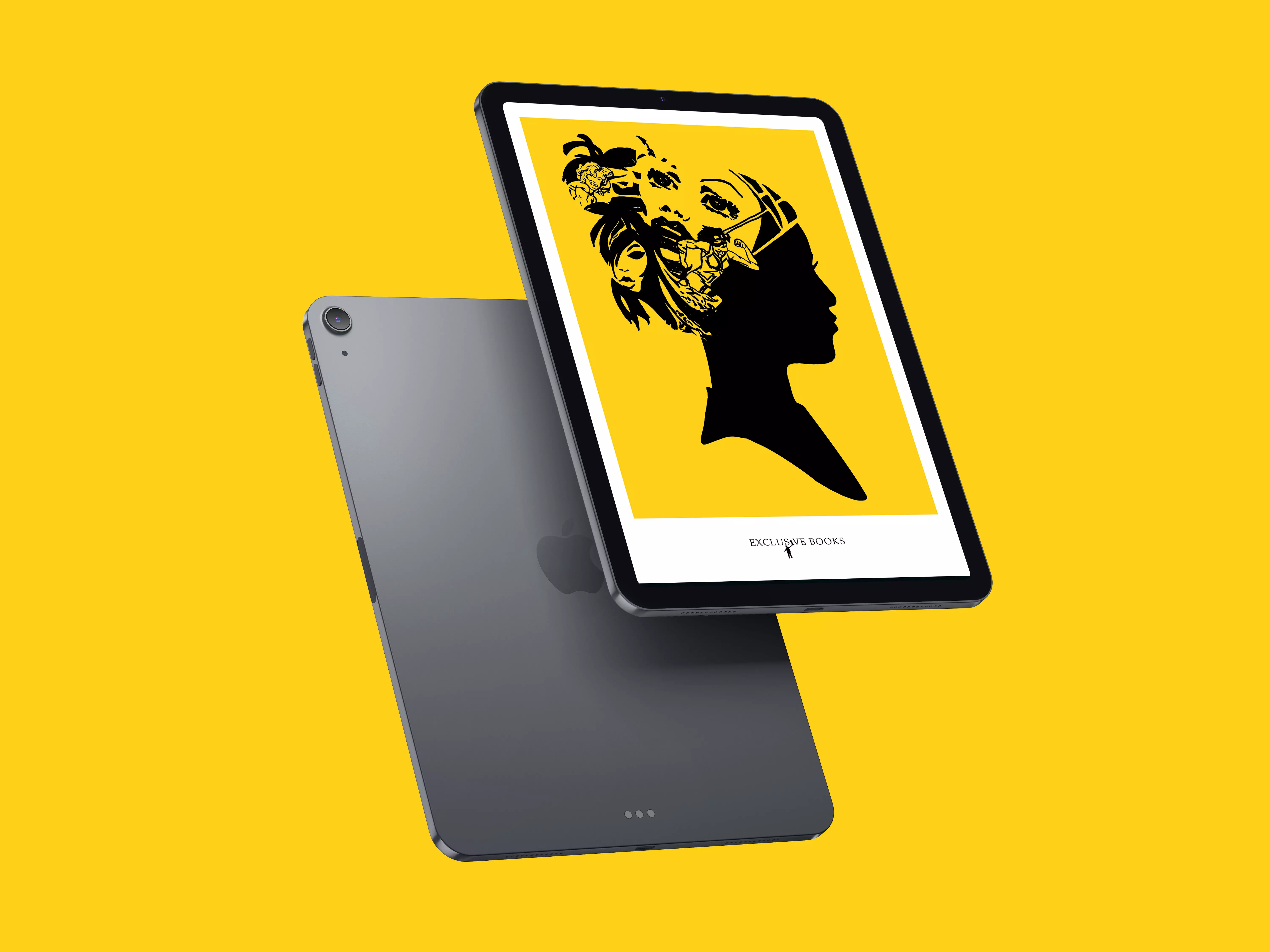
There’s a graphic novel for you. A hand-drawn illustration design targeting women and men and their favourite graphic novels, these illustrations were later edited digitally into a vector...
